In the NBA, several teams have subtly and drastically changed the look of their apparel, uniforms and logo designs over the years as a means of separating them from identities that are formerly associated with a losing past.
There are some like the Atlanta Hawks and Cleveland Cavaliers, who have won big games in the playoffs and had successful seasons, but remain in a major championship drought.
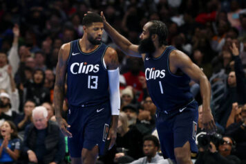
There are others who have a long and storied tradition of being moribund for the vast majority of their existence; teams like the Los Angeles Clippers, whose reputation up until the last four years had strictly been associated with ineptitude.
And then there are others, like the Golden State Warriors, Washington Wizards, and Milwaukee Bucks, all of whom have at least one championship, but had become estranged from their winning traditions for quite some time.

(Photo Credit: basketexpress.net)
Those franchises have incrementally moved toward various visual changes to their logo identities and uniforms in the recent past.

The Wizards all but removed their slate blue, metallic gold, and black days from the premises, translating their current look from a previous time when Wes Unseld and Earl The Pearl Monroe were champions — but they still didnt get rid of that wizard right away.
![]()
During last years playoffs, the team made a change to something more monumental. Though its not obvious, the Washington Monument is a structure that was erected to evoke a sense of masculinity and power. Standing straight up at the floor of the heavens, it was intended to be authoritative without having to assert an obviously fearful appearance. Now, does that work for a basketball team thats striped from chest to thigh?

Thats debatable, but the mere depiction of superiority is one example of aggressive visual translation.
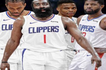
The Clippers, though a great success last year, have done away with their faux-Los Angeles Lakers look, bringing forth something different (and different is about all you can for a logo that looks more like something youd see on printer paper packaging).

(Photo Credit: fansided.com)
Having spent many years with a team insignia that was essentially an un-artful reinterpretation of its neighbors, the Clippers today are bolder. And just the mere appearance of boldness suggests that they are attempting to be more than their past (and if you buy all the nautical narrative lines on the re-design, thats not too hard to buy into).
![]()
The Milwaukee Bucks hadnt ever really found a look that the fan base really agreed with since their days as champions back in 1971 with the formerly-named Lew Alcindor and Oscar Robertson. Years spent looking to appear different but new, near to its identity, and get back to something that they appeared to be in the first place have all fallen short until now.
Perhaps, their visual appearance taking more after the characteristics of Wisconsin can be a positive shift on the franchise, but their more obvious mascot has finally taken on the anger that visually stimulates fans. Gone are the docile, stoic buck, and the jolly deer with glee. Todays animal is more predator than prey, with an angrier demeanor than your typical fawn.
The Hawks, a team once widely known for its red and yellow-gold boldness, have often in the last 20 years pushed for increased intensity and authority in their identity.
The Dominique Wilkins era was brushed with an unforgettable stoicism and grandeur, but the team didnt move so far in the postseason. Atlanta tried to revamp its looks, making its hawk identity a larger presence, but when that that failed to inspire any changes, the team went to a past that was only dimly remembered in navy blue and red.

(Photo Credit: nba.com)
As the Hawks won and topped out as also-rans, the decision to reintegrate and accent the chief symbol from the past now looms large, but fresh. Neon and black capitalize a brand that now identifies with youth and uncertainly with a look that communicates more trend than aggression.
Charlottes first-generation of fans saw the Hornets being moved to New Orleans and recoded as Pelicans, while a substitute squad of Bobcats came to (unsuccessfully) fill the old Hornets gap. Its why Hugo is frowning for a new Hornets team in clothed in black.

What does it all mean? Well, from a business standpoint, merchandise is always a factor and the profits that come from it being sold can catapult a teams bottom line a great deal.
It can also help a franchise distance itself from murky past as it transitions toward a promising future.